15 Highly Rated Packaging Design Ideas for Household Products Around the World
Packaging design plays a crucial role in attracting customers and creating a positive first impression of a product. In today’s highly competitive market, having an eye-catching packaging design can make all the difference in a product’s success. From bright colors to unique shapes and innovative materials, there are endless possibilities when it comes to packaging design.
In this article, we will explore 15 highly rated household product packaging design ideas from around the world. These designs have received praise and recognition for their creativity, functionality, and ability to stand out in a sea of products. So, let’s dive in and discover some amazing packaging design ideas that have captured consumers’ attention and left a lasting impression.
Lambro (Showerhead)
Simple design with a touch of luxury
The packaging design for Lambro’s showerhead is a perfect example of how simplicity can be elegant and eye-catching. The box itself is mainly white with gold, silver, and copper accents, giving it a luxurious feel. These metallic colors also evoke images of stainless steel, which is often associated with high-quality and durable products.
The showerhead’s name, Lambro, is creatively displayed in a bold font on the front of the package, making it easily recognizable. The rest of the design is kept minimal, allowing the product to take center stage. This design not only looks beautiful but also effectively conveys the product’s quality and value.
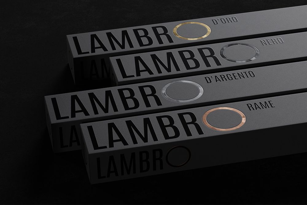
The packaging design for Lambro’s showerhead exemplifies how simplicity can be both elegant and visually striking
Conkrēta (Cement)
A unique take on cement packaging
Cement may not be the first thing that comes to mind when you think of creative packaging design. However, Conkrēta has managed to create a packaging design that stands out from its competitors while still being practical and functional.
The design features a black and white theme with different patterns for each type of cement. The brand name, Conkrēta, is a play on the Esperanto word for concrete, adding a unique touch to the packaging. The use of different patterns not only adds visual interest but also makes it easier for customers to differentiate between the various types of cement.
Menhir (Men’s Shower Gel)
Inspired by nature
The packaging design for Menhir’s men’s shower gel draws inspiration from its brand name. Menhirs are large, upright stones that were often used in ancient times as monuments or landmarks. The brand has successfully incorporated this concept into their packaging design.
The shower gel comes in a sleek and modern bottle with natural stone colors and textures. These elements not only reflect the brand’s name but also give the product a masculine and sophisticated look. The name Menhir sounds like “men” and relates to the shape of the stone, making it an ideal choice for a men’s shower gel.
Kasturi Incense Stick
A packaging design that delights the senses
Kasturi’s incense sticks come in a uniquely designed cylindrical box that catches the eye and intrigues the senses. The box is six-sided, with each side featuring a different color and visual pattern, representing the various fragrances available.
What sets this packaging design apart is its attention to detail. The box has a textured finish, giving it a tactile feel, and features small cutouts in the shape of the incense sticks, allowing the customer to see and smell the product before purchase. This design not only looks beautiful but also appeals to the customer’s sense of touch and smell.
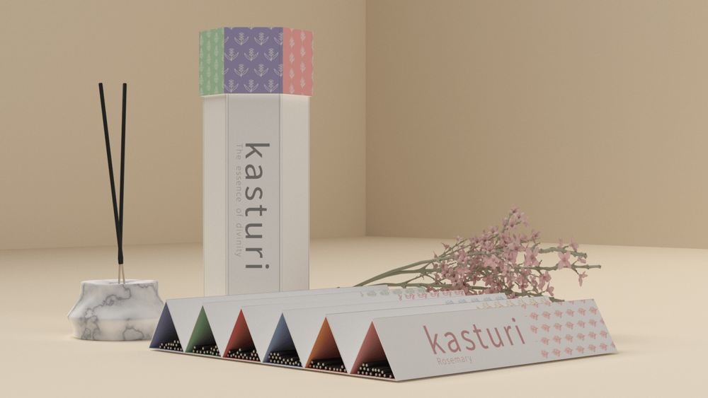
Kasturi’s incense sticks are housed in a uniquely designed cylindrical box that captivates the eye and engages the senses
Greenly Packaging (Small Planters)
Eco-friendly and functional
Greenly Packaging has taken a creative and eco-friendly approach to packaging design with its small planters. The packaging is made from seed paper that dissolves in water, leaving behind seeds to grow. This design not only reduces waste but also encourages customers to adopt a sustainable lifestyle.
The packaging’s open design allows the plant to be visible, making it an attractive and convenient planter. This design not only looks beautiful but also serves as a functional part of the product. It’s a perfect example of how packaging can be both aesthetically pleasing and environmentally friendly.
Boat (Tissue Box)
Nautical-themed packaging
Boat’s tissue box is a unique and playful take on traditional tissue boxes. The packaging is shaped like a ship, making it an ideal choice for nautical themed environments such as beach houses or boats. The design is not only eye-catching but also functional, with easy access to tissues through the ship’s chimney.
This packaging design is a great example of how brands can incorporate fun and creativity into their packaging while still meeting functional standards. It’s also a great way to differentiate their product from competitors in a crowded market.
WOSH Future Laundry (Laundry Detergent)
A scientific approach to packaging design
WOSH Future Laundry has taken a unique and modern approach to its packaging design, targeting consumers who are looking for something different and innovative. The laundry detergent comes in a transparent, tube-like container that helps users dispense a specific amount and differentiate between different types of detergent.
The packaging’s design gives off a science experiment feel, which ties in with the brand’s name, WOSH, being an abbreviation of “Wash Optimized Science.” This design not only looks cool but also appeals to consumers who value convenience and efficiency.
Always Sunny (Cactus)
A fresh and modern packaging design
Always Sunny’s cactus packaging design is all about simplicity and minimalism. The packaging is mainly white, with a vibrant green illustration of a cactus on the front. This design not only looks modern and aesthetically pleasing but also aligns with the product itself, a cactus that acts as a lasting gift.
The name, Always Sunny, is also displayed in a playful font, adding to the package’s overall charm. This packaging design effectively represents the product’s vibrant and cheerful nature while also being visually appealing.
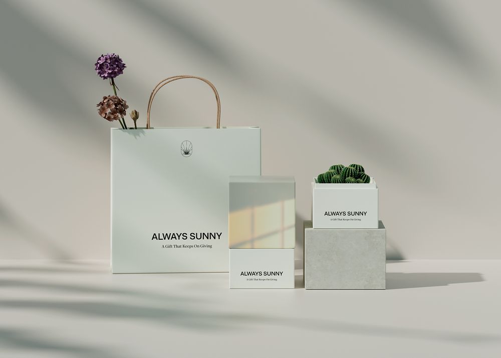
The cactus packaging design from Always Sunny embodies simplicity and minimalism
FU – Spray Acrylic Paint
A rebellious and edgy packaging design
FU’s spray acrylic paint packaging design is not afraid to push boundaries and be edgy. The brand has used profanity with a playful twist by replacing some letters with paint splatters, making it stand out from other paint brands on the market.
This packaging design perfectly reflects the rebellious spirit of graffiti art and makes it easy for customers to choose their preferred color from the different splatter patterns. It’s a bold and daring choice that has received positive feedback from consumers and industry experts alike.
Coca-Cola (Bottle)
Iconic and instantly recognizable
Coca-Cola’s iconic bottle design is undoubtedly one of the most famous and recognized packaging designs in the world. The brand’s signature contour bottle was introduced in 1915 and has remained largely unchanged ever since.
The curved shape and green glass make it stand out on shelves, and the red and white logo is easily distinguishable from a distance. These elements, along with the product’s consistent taste and quality, have made Coca-Cola’s packaging design a timeless classic.
Nutella (Jar)
Simple yet effective
Nutella’s jar design is another example of how simplicity can be powerful. The brand’s logo, a red and white label with its name written in bold black font, is instantly recognizable. The jar itself is mainly transparent, allowing the product’s rich and creamy texture to be visible.
The jar’s round shape is also reminiscent of a hazelnut, the main ingredient in Nutella. This simple yet effective packaging design has become a staple in many households, further solidifying the brand’s popularity and success.
Apple (iPhone Box)
Sleek and functional
Apple is known for its sleek and minimalist design, and this philosophy extends to its packaging as well. The iPhone’s box is simple yet elegant, with a clean white exterior and a minimalistic illustration of the product on the front. This design effectively conveys the brand’s focus on simplicity and quality.
Inside, the product is neatly packaged in a tray, making it easy for consumers to unbox their new device. The packaging also includes a charging cable, earphones, and a user manual, all neatly placed in separate compartments. This attention to detail and functionality sets Apple’s packaging design apart from its competitors.
Tiffany & Co. (Jewelry Box)
Luxurious and instantly recognizable
Tiffany & Co.’s iconic blue jewelry box is synonymous with luxury and elegance. The brand’s signature color, aptly named “Tiffany Blue,” has become instantly recognizable worldwide. The box itself is simple, with a white ribbon tied around it, but it’s the color that makes it stand out.
This packaging design not only aligns with the brand’s image but also adds value to the product. The box has become a status symbol in itself, and many customers keep and reuse it even after purchasing their jewelry. It’s a perfect example of how packaging can elevate a product and create a memorable experience for the customer.
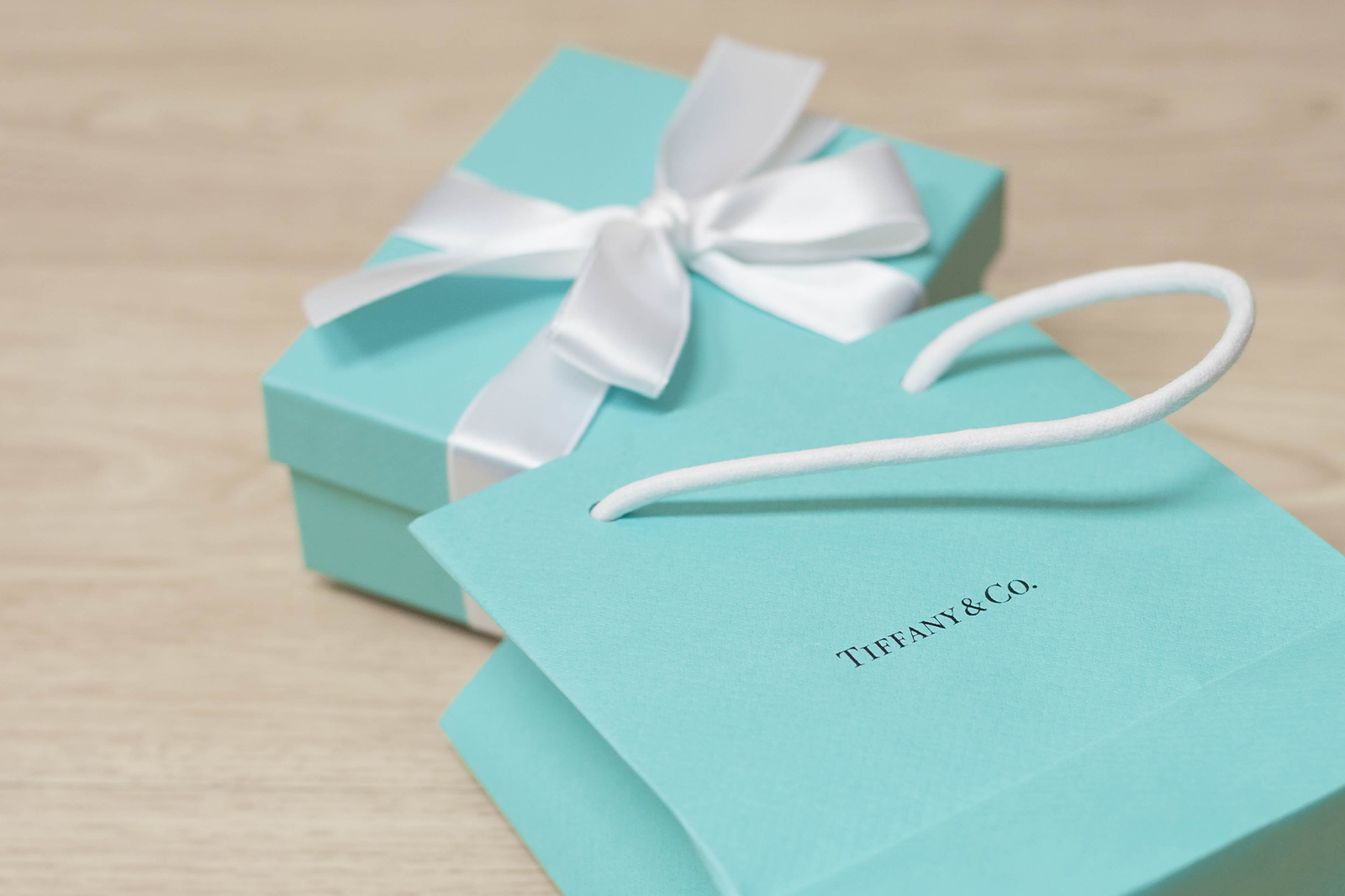
The brand’s iconic color, known as “Tiffany Blue,” is instantly recognizable worldwide
Toblerone (Chocolate Bar)
Iconic and unique
Toblerone’s chocolate bar packaging design is another example of how a simple design can become iconic and instantly recognizable. The triangular shape and golden wrapper make it stand out among other chocolate brands. The brand’s name is displayed prominently in bold red font, along with an illustration of a mountain, representing the Swiss Alps.
The packaging design also features a unique pyramid-shaped window, allowing customers to see the product’s distinctive shape. This packaging design has successfully become a part of the brand’s identity and has contributed to its continued success.
Pringles (Can)
A unique and functional can design
Pringles’ can design is an excellent example of how packaging can be both unique and functional. The cylindrical shape and iconic red and blue logo have become instantly recognizable. The can also features a resealable lid, allowing customers to snack on their favorite chips without having to finish the entire can in one sitting.
The packaging’s design not only stands out on shelves but also makes it easy for customers to consume the product. It’s a great example of how packaging can add value to a product and enhance the customer experience.
Conclusion
Packaging design is an essential aspect of a product’s success, and these 15 highly rated household product packaging designs are a testament to that. From simplicity and minimalism to bold and creative designs, there is no one-size-fits-all approach when it comes to packaging design. Each product and brand has its unique qualities, and the packaging design should reflect that.
In today’s competitive market, having an eye-catching packaging design can make all the difference in a product’s success. It’s not only about aesthetics but also functionality and creating a positive first impression. These 15 packaging designs have successfully achieved this and have left a lasting impression on consumers worldwide.


Post Comment