Find endless creative inspiration from the 25 most notable packaging design projects of 2023
Packaging design is an important aspect of branding and marketing for any product. It is the first thing a customer sees when they encounter a product on the shelf, and it can heavily influence their purchasing decision. A well-designed package not only catches the eye but also conveys important information about the product and its brand.
In recent years, there has been a surge in unique and innovative packaging designs that have redefined the traditional approach to packaging. As we look ahead to 2023, the packaging design industry is expected to continue pushing boundaries and creating new trends. In this article, we will explore the top 25 packaging design projects of 2023 that have caught our attention and inspired us with their creativity and uniqueness.
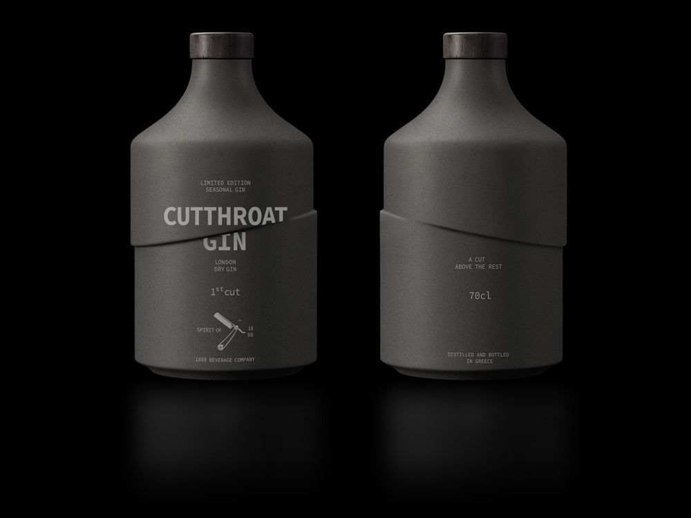
Cutthroat Gin and Tonic: Modern and Minimalistic Design
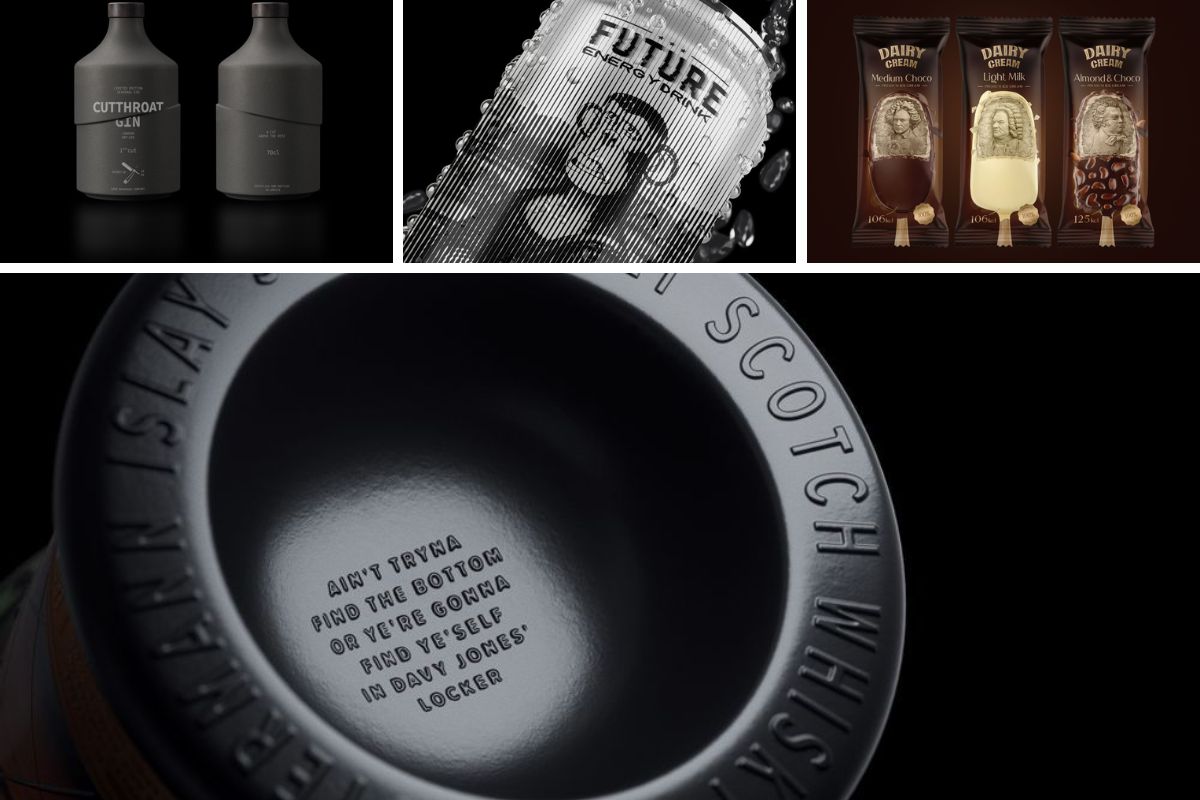
The packaging design for Cutthroat Gin and Tonic is a perfect example of how less can be more. The design is modern and minimalistic, with a clean cut that showcases the sharp flavor of the gin. The use of bold, black typography against a white background gives the bottle a sleek and sophisticated look.
The cylindrical shape of the bottle adds to the overall aesthetic, and the rough texture evokes natural elements like tree bark. This design choice not only sets it apart from other bottles on the shelf but also alludes to the natural ingredients used in the gin. Overall, the packaging successfully conveys the premium quality of the product and creates a strong visual impact.
The brand’s distinctive “Tiffany Blue” color is globally renowned for its instant recognition
Clean and Bold Typography
The use of bold typography in the packaging design of Cutthroat Gin and Tonic is a key element in its success. The clean, sans-serif font exudes sophistication and simplicity, while the black color creates a stark contrast against the white background. This makes it easy for customers to read and identify the brand and product name.
Cylindrical Bottle with Natural Elements
The cylindrical shape of the bottle is an unconventional design choice that works exceptionally well for this product. Its sleek and smooth surface, combined with the rough texture, gives it a unique and eye-catching appearance. The use of natural elements like tree bark in the packaging design also adds to the overall aesthetic and creates a sense of authenticity.
Premium Quality Representation
Cutthroat Gin and Tonic prides itself on using premium, hand-picked ingredients to create its distinctive flavor. This is effectively conveyed through the packaging design, which exudes luxury and quality. The black and white color scheme, along with the clean and bold typography, creates a high-end look that resonates with the brand’s target audience.
Lemon Tree Beer: Refreshing and Bold Design
Lemon Tree Beer’s packaging design is all about capturing the essence of summer and refreshment. The design features a bright yellow color scheme, with bold typography and illustrations of lemons, creating a vibrant and eye-catching look.
The choice of using a can instead of a bottle adds to the convenience and portability of the product, making it a perfect choice for outdoor activities. The addition of a resealable lid also allows customers to save the drink for later, adding to the product’s value.
Summer Vibes in a Can
Lemon Tree Beer’s packaging design effectively captures the essence of summer with its bright and bold design. The use of a vibrant yellow color scheme, coupled with illustrations of lemons, creates a refreshing and lively look that instantly evokes feelings of warmth and sunshine. This design choice is strategic as it appeals to consumers looking for a light and refreshing beverage, especially during the hot summer months.
Convenience and Portability
The decision to package Lemon Tree Beer in a can rather than a bottle adds to the convenience and portability of the product. Cans are easier to transport, chill quickly, and are more lightweight, making them ideal for outdoor activities like picnics, barbecues, or beach days. The addition of a resealable lid also allows consumers to enjoy the drink at their own pace without worrying about spillage, further enhancing the product’s appeal.
Bold Typography
The use of bold typography on Lemon Tree Beer’s packaging not only adds to the overall aesthetic but also serves a functional purpose. The large, easy-to-read text makes it effortless for customers to identify the brand and product, even from a distance. This is crucial in a crowded market where products compete for attention on store shelves. The bold typography, combined with the vibrant colors and illustrations, creates a cohesive and eye-catching design that stands out to potential buyers.
Molvias Pizza: Practical and Easy-to-Use Packaging
Molvias Pizza has taken a practical approach to their packaging design by focusing on easy-to-use packaging for pizza parties. The design features a sturdy cardboard box with perforated lines for easy opening and handles for convenient carrying. It also includes separate compartments for different toppings, ensuring they do not mix during transportation.
The simplistic design with bold typography and minimal use of colors reflects the brand’s no-frills approach to making pizza. The packaging effectively conveys the brand’s promise of providing a quick, hassle-free, and delicious pizza experience.
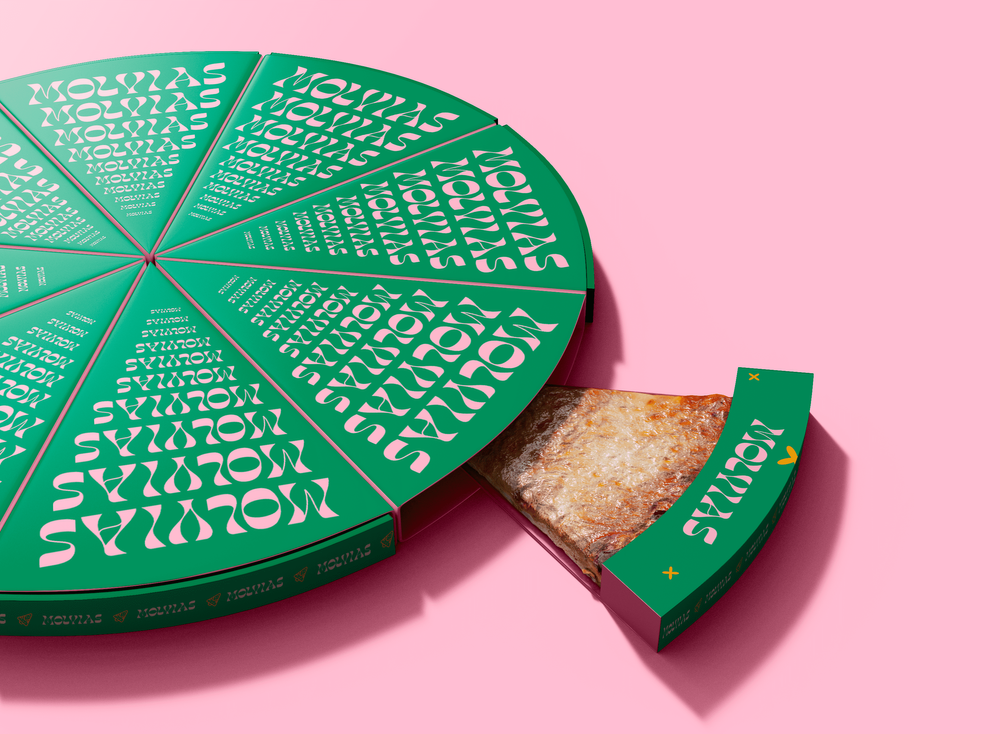
Molvias Pizza has adopted a practical approach to packaging design, emphasizing ease-of-use for pizza parties
Sturdy and Convenient Packaging
One of the main pain points of ordering a pizza is the struggle to open and transport a large, floppy pizza box. Molvias Pizza has addressed this issue with their packaging design by incorporating sturdy cardboard material and perforated lines for easy opening. The addition of handles for carrying is also a thoughtful convenience for customers.
Compartments for Toppings
The use of separate compartments for toppings in the packaging design is a game-changer. It prevents the toppings from getting mixed up during transportation, ensuring the perfect pizza experience for customers. This feature also makes it easier for customers to customize their pizzas with different toppings, adding to the overall convenience of the packaging.
Minimal and Effective Design
Molvias Pizza has nailed the “less is more” approach with their packaging design. The use of bold typography against a white background, with minimal colors, creates a no-frills and straightforward design that conveys the brand’s promise of providing delicious and hassle-free pizza. The simplicity of the design is also cost-effective for the brand, making it a win-win situation.
Norlo Coffee: Light and Delicate Scandinavian Design
Norlo Coffee has taken inspiration from the Scandinavian design style with their packaging design for their light and delicate coffee flavor. The design features a light blue color scheme and a clean, minimalist layout that reflects the brand’s commitment to natural and sustainable ingredients.
The use of contrasting dark-colored coffee packaging adds to the overall aesthetic and makes the product stand out on the shelf. The incorporation of Scandinavian elements, such as simple geometric shapes and clean lines, gives the packaging a modern and trendy look.
Inspiring Scandinavian Design
Scandinavian design is known for its simplicity, functionality, and minimalism. Norlo Coffee has successfully captured these elements in their packaging design, creating a visually appealing and modern look. The use of simple geometric shapes and clean lines adds to the overall aesthetic and represents the brand’s commitment to natural and sustainable ingredients.
Clean and Contrasting Color Scheme
The use of light blue as the primary color in the packaging design is a strategic choice. It evokes a sense of calmness and tranquility, reflecting the delicate and light flavor profile of the coffee. The contrast of the blue against the dark-colored coffee packaging also makes the product stand out on the shelf, catching the customer’s eye.
Premium Quality Representation
Norlo Coffee prides itself on using high-quality, sustainable, and natural coffee beans. This is effectively conveyed through the packaging design, which exudes luxury and quality. The clean and minimalistic design, along with the use of contrasting colors, creates a high-end look that is sure to attract the brand’s target audience.
Dairy Cream Ice Cream: High-End Packaging with Famous Composers
Dairy Cream Ice Cream has taken a unique approach to their packaging design by incorporating sculpted images of famous composers like Beethoven, Bach, and Schubert. This not only adds an artistic and creative touch to the packaging but also showcases the brand’s luxury and quality.
The use of gold and black in the color scheme further enhances the high-end look of the packaging. The addition of embossed details, such as musical notes and instruments, adds texture and dimension to the design, making it visually appealing and sophisticated.
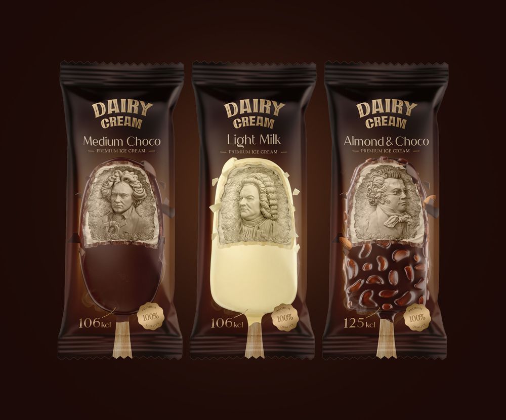
Dairy Cream Ice Cream has innovatively incorporated sculpted images of renowned composers such as Beethoven, Bach, and Schubert into their packaging design
Artistic and Creative Design
The incorporation of sculpted images of famous composers in the packaging design for Dairy Cream Ice Cream is a bold and unique move. It adds an artistic and creative element to the packaging and ties into the brand’s promise of providing a premium ice cream experience. This approach also sets the product apart from other ice creams on the shelf, making it memorable and eye-catching.
Gold and Black Color Scheme
The use of gold and black as the primary colors in the packaging design is a strategic choice. These colors are commonly associated with luxury and high-end products, effectively conveying the brand’s positioning. The combination of these colors also creates a stark contrast, making the packaging stand out from the rest.
Embossed Details for Texture and Dimension
Embossing is a popular technique used in packaging design to add texture and depth to the design. Dairy Cream Ice Cream’s packaging features embossed details like musical notes and instruments, adding a tactile element to the design. This not only makes the packaging visually appealing but also reflects the brand’s attention to detail and commitment to quality.
Positive Band-aid: Everyday Hero for Everyday Heroes
Designing packaging for medical products is a unique challenge, as it has to balance functionality with aesthetics. BPositive Band-aid has successfully achieved this balance with their packaging design, which is designed to be an everyday hero for everyday heroes. The packaging features a bright and bold design with a superhero theme, effectively promoting the use of BPositive band-aids for minor injuries.
The addition of instructions and illustrations on how to use the product adds a functional element to the design. The bright orange color scheme also helps the product stand out on the shelf, making it easily identifiable in case of emergencies.
Fun and Playful Design
Positive Band-aid’s packaging design is fun and playful, making it appealing not just to children but also adults. The use of superhero-themed illustrations and bright colors creates a sense of joy and positivity, which is important when dealing with injuries. This design approach also sets the product apart from other plain and functional band-aid packages.
Functional Instructions and Illustrations
Incorporating instructions and illustrations on how to use the product in the packaging design is a thoughtful and practical choice. It not only adds a functional element to the design but also makes it easier for customers to understand and use the product correctly. This is especially helpful for those who are not familiar with using band-aids or have language barriers.
Eye-Catching Orange Color Scheme
The use of bright orange as the primary color in the packaging design is a strategic choice. It is a color commonly associated with energy and positivity, making it a perfect fit for a product that promotes healing. The vibrant color also helps the product stand out on the shelf, catching the customer’s eye and increasing the likelihood of purchase.
Klabautermann Islay Single Malt Whisky: Mythical Inspiration
The packaging design for Klabautermann Islay Single Malt Whisky is inspired by the mythical Klabautermann, a creature believed to be the guardian of ships and sailors. The bottle’s shape and design represent the whisky’s journey at sea, with embossed details like maps, anchors, and steering wheels, adding to the overall aesthetic.
The use of a dark color scheme and gold foil accents gives the packaging a premium and luxurious look, reflecting the high-quality whisky inside. This packaging design effectively captures the essence of the product and creates a visual representation of its story and inspiration.
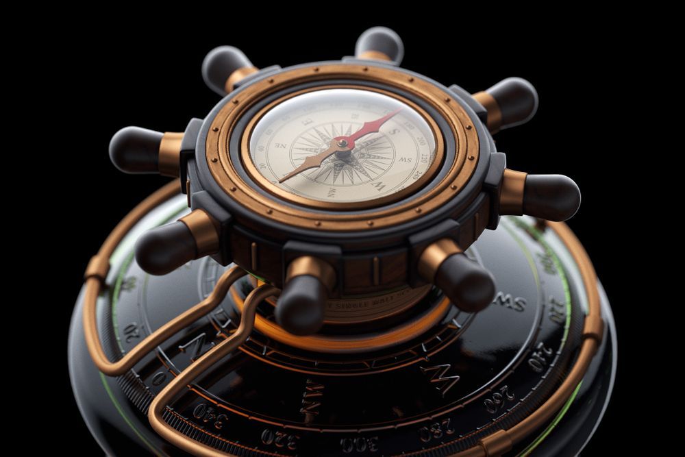
The packaging design of Klabautermann Islay Single Malt Whisky draws inspiration from the mythical Klabautermann, a legendary guardian of ships and sailors
A Design Inspired by Mythology
The incorporation of elements from mythology in packaging design adds an element of mystery and intrigue. Klabautermann Islay Single Malt Whisky’s packaging design takes inspiration from the mythical Klabautermann, creating a unique and captivating look. The choice of this particular myth also ties into the brand’s Scottish roots and adds a sense of authenticity.
Emphasizing the Whisky’s Journey
The unique shape and design of the bottle reflect the whisky’s journey at sea, as does the use of embossed details like maps, anchors, and steering wheels. This adds a storytelling element to the packaging design and creates a visual representation of the product’s history and inspiration. It also makes the packaging stand out on the shelf, catching the customer’s eye and piquing their curiosity.
Luxurious Color Scheme
The use of a dark color scheme with gold foil accents is a classic choice when it comes to luxury products. It effectively conveys the premium quality of the whisky and makes the packaging look sophisticated and upscale. The contrast of the dark colors against the embossed gold details also adds texture and dimension to the design, making it visually appealing and memorable.
Art Appetite – Sardines: Celebrating Portuguese Culture
Sardines from Portugal are a popular delicacy, and the packaging design for Art Appetite’s range of sardines pays tribute to the country’s culture and history. The packaging features artwork inspired by famous Portuguese landmarks, showcasing the country’s fishing industry and tourist destinations.
The use of bold and vibrant colors in the artwork adds a playful and artistic touch to the packaging design. It effectively communicates the brand’s mission of creating unique and flavorful sardine products while also promoting the country’s culture.
Artistic Representation of Culture
Art Appetite’s packaging design for sardines is more than just a pretty picture. It celebrates and promotes Portuguese culture through its use of artwork inspired by famous landmarks. This not only adds an artistic and creative element to the design but also creates a sense of pride and connection for customers who are familiar with these places.
Playful Use of Color
The artwork on the packaging features bold and vibrant colors, adding a playful and eye-catching element to the design. This is a great way to differentiate the product from other sardine brands that often have dull and unappealing packaging. The use of bright colors also reflects the brand’s promise of creating unique and flavorful products.
Uniquely Shaped Can
The use of a uniquely shaped can instead of a traditional rectangular one is a smart and strategic choice. It not only adds to the overall aesthetic but also makes the product stand out on the shelf among other canned goods. This, combined with the colorful artwork, makes the packaging design memorable and distinct.
Flora – Honey: Eco-Friendly and Sustainable Design
Flora’s honey packaging design is a perfect example of how a brand’s sustainability values can be reflected in their packaging. The design features a glass jar with a wooden lid and a paper label that can be easily removed for recycling. It effectively conveys the brand’s commitment to eco-friendly and sustainable practices.
The label design features illustrations of bees, flowers, and honeycomb, tying into the product’s natural and organic origins. The use of earthy colors and simple typography adds to the overall aesthetic and creates a warm and inviting look.
Sustainable Packaging Design
Flora’s honey packaging design is designed with sustainability in mind. The use of a glass jar and wooden lid makes it easy to reuse or recycle the packaging. The paper label can also be easily removed for recycling purposes. This reflects the brand’s commitment to reducing their environmental impact and adds value to their product.
Natural and Organic Visuals
The label design for Flora’s honey features illustrations of bees, flowers, and honeycombs, which are closely associated with the product’s origins. This not only adds to the aesthetic but also ties into the brand’s promise of providing natural and organic honey. These visuals also create a connection with customers and make the product stand out on the shelf.
Warm and Inviting Aesthetic
The combination of earthy colors, simple typography, and natural illustrations gives Flora’s honey packaging an inviting and warm aesthetic. It effectively conveys the idea of a wholesome and natural product that is perfect for everyday use. The simplicity of the design also makes it easy for customers to identify the brand and product name, adding to its appeal.
Future Energy Drink: Inspired by NFTs
The rise of non-fungible tokens (NFTs) has inspired many industries, including packaging design. The packaging for Future Energy Drink features a playful monkey with various expressions, combined with Mona Lisa’s iconic smile. This unique combination of elements creates a visually appealing and thought-provoking design that stands out on the shelf.
The use of stripes in the background creates an illusion effect, adding depth and dimension to the packaging. The black and white color scheme further enhances the design’s impact, making it stand out among other energy drinks’ bright and loud packaging.
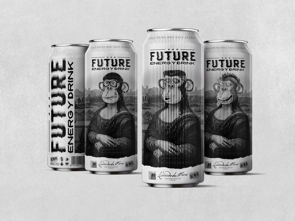
The packaging of Future Energy Drink showcases a playful monkey with a range of expressions, complemented by the iconic smile of the Mona Lisa
Playful and Memorable Design
Future Energy Drink’s packaging design is memorable and playful, making it instantly recognizable. The use of the monkey with different expressions adds a fun element to the design while also tying into the brand’s name. It creates a sense of curiosity and intrigue, drawing customers in and leaving a lasting impression.
Influential Use of NFTs
By incorporating elements of NFTs into their packaging design, Future Energy Drink successfully taps into the current trend and creates a unique selling point for their product. The playful references to Mona Lisa also add an artistic and creative touch, making the design stand out in a sea of similar products.
Illusion Effect with Stripes
Stripes are a popular design element, and their use in the packaging design for Future Energy Drink is both effective and strategic. The stripes create an illusion effect that adds depth and dimension to the design, making it visually appealing and dynamic. It also makes the product look larger and more prominent on the shelf, catching the customer’s eye even from a distance.
Conclusion
In conclusion, packaging design plays a crucial role in shaping consumer perceptions, influencing purchasing decisions, and communicating a brand’s values and identity. Each of the examples discussed above demonstrates how thoughtful and strategic packaging design can elevate a product, differentiate it from competitors, and create a lasting impression on customers.
From the elegant and sophisticated packaging of Macallan Whisky that emphasizes the brand’s heritage and quality, to the playful and artistic sardine cans of Art Appetite that celebrate Portuguese culture, and the eco-friendly honey jars of Flora that reflect sustainability values, each design tells a unique story and connects with consumers on a deeper level.
It is evident that successful packaging design goes beyond aesthetics; it is a powerful tool for brands to communicate their ethos, establish an emotional connection with consumers, and ultimately drive sales. By understanding the importance of packaging design and implementing innovative and creative solutions, brands can effectively position themselves in the market, attract their target audience, and build a loyal customer base.


Post Comment